What's New in Graylog 7.0: UI Features
A look at the UI improvements introduced in Graylog 7.0
Widget Enhancements in Graylog 7.0
Graylog 7.0 introduces a set of UI improvements designed to make working with data faster and more intuitive. New threshold lines, Markdown widgets, and interactive data drill-downs make it easier to spot trends and communicate insights at a glance.
Interactive Popovers in Chart Widgets
Clicking on a data point in a chart widget now opens a popover that lists all related values for that point. From there, you can perform a number of actions directly on the selected data.
Step 1 — Hover over a data point in the widget:
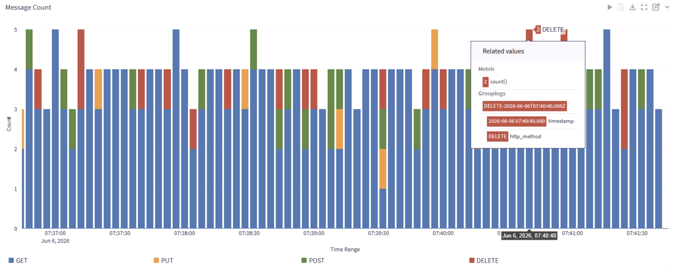
Step 2 — Click to open the popover menu:
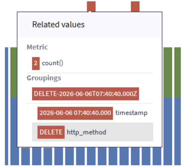
Step 3 — Select a value to reveal the context menu:
Here we choose value “DELETE” in field “http_method”.
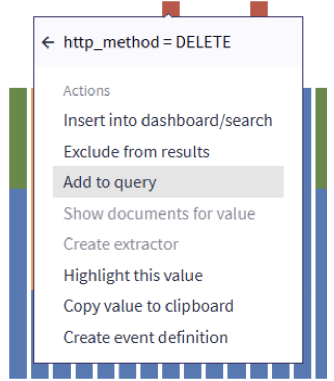
Now for example you can add this field value to the filter condition in the query.
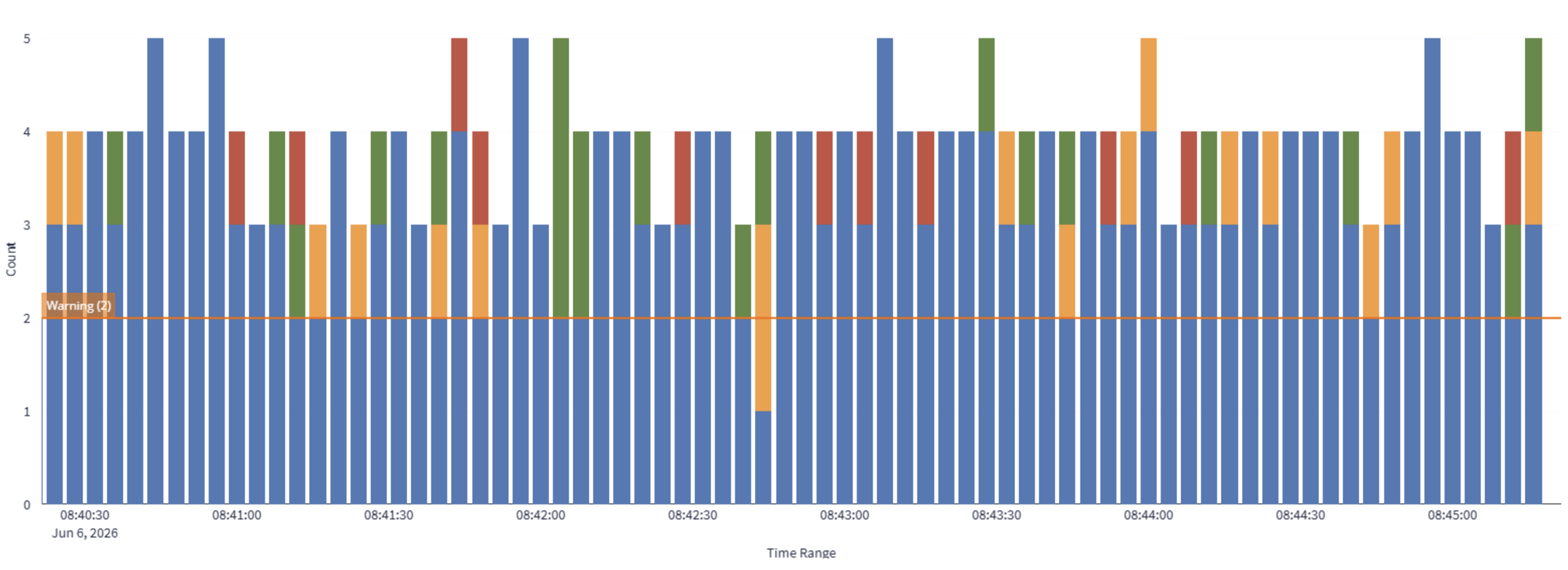
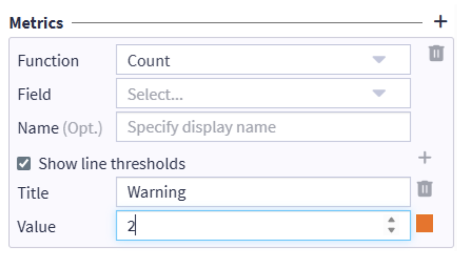
Threshold Lines
You can now add threshold lines to chart widgets. Thresholds are defined in the metrics configuration and are rendered as reference lines in the chart, making it easy to see at a glance whether values are within an expected range.
Threshold line displayed in a chart:
Threshold configuration in metrics:
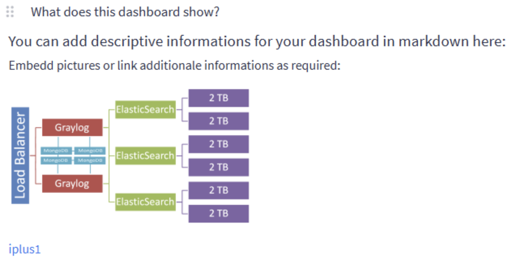
Text & Markdown Widget
A new Text/Markdown widget type can be added to searches and dashboards. This lets you embed formatted text and pictures alongside your data, create links to external documentation — ideal for providing context, adding usage notes, or helping other users interpret results correctly.
Example of a Markdown widget on a dashboard:
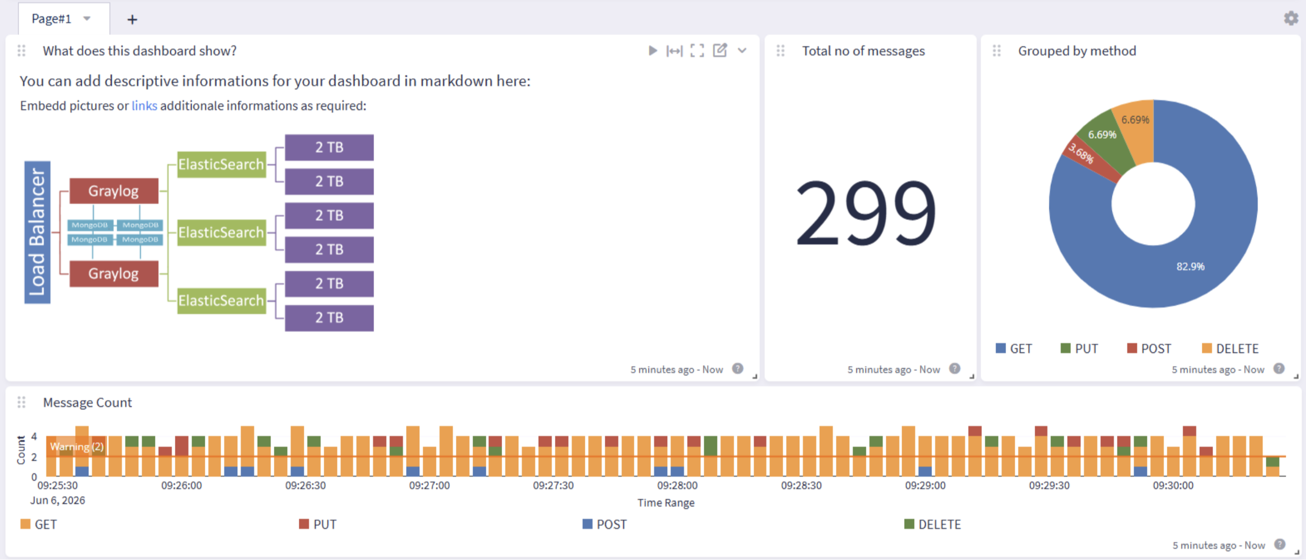
A closer look at the widget content:
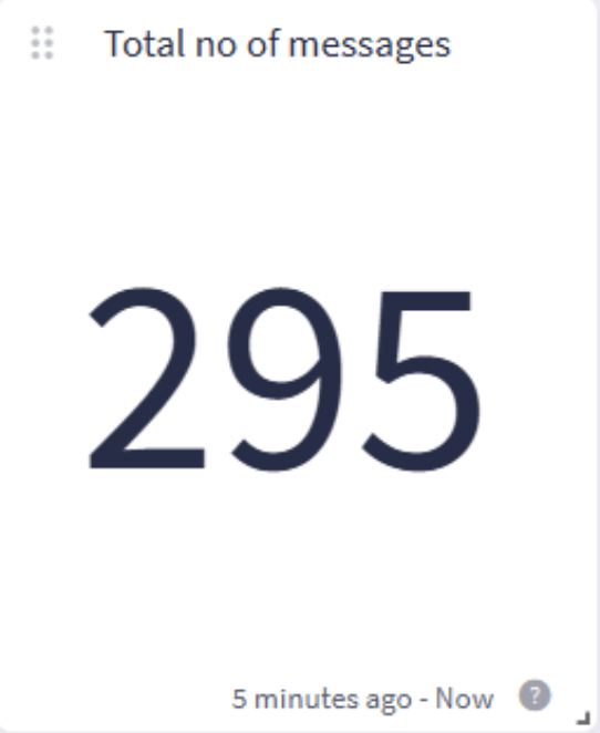
Cleaner Widget Grid
The widget toolbar icons and drag handle are now hidden by default and only appear when you hover over a widget. This reduces visual clutter in the widget grid and improves the readability of the title, especially for small widgets, without affecting editing or export capabilities.
Before (left) and after (right):